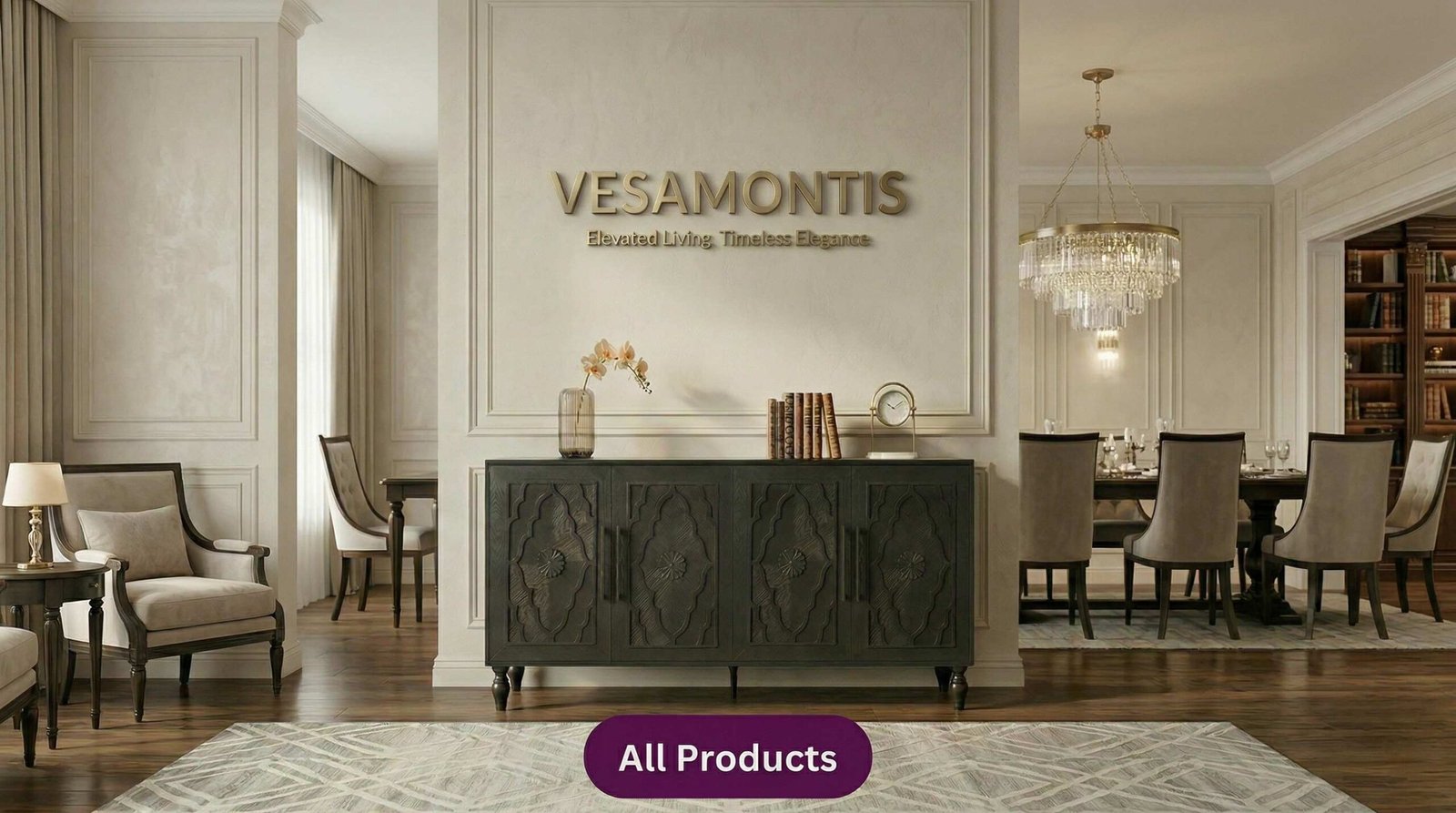
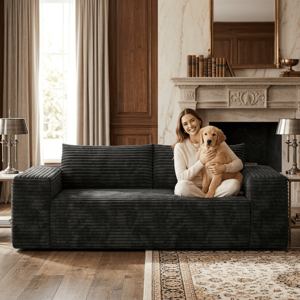
Minimal copy. Larger imagery. A calmer, more luxurious first impression.
Large imagery first. Fewer blocks. A cleaner, more premium rhythm for the homepage.
One strong visual band, just like the reference site. Bigger image. Smaller copy. Higher-end mood.
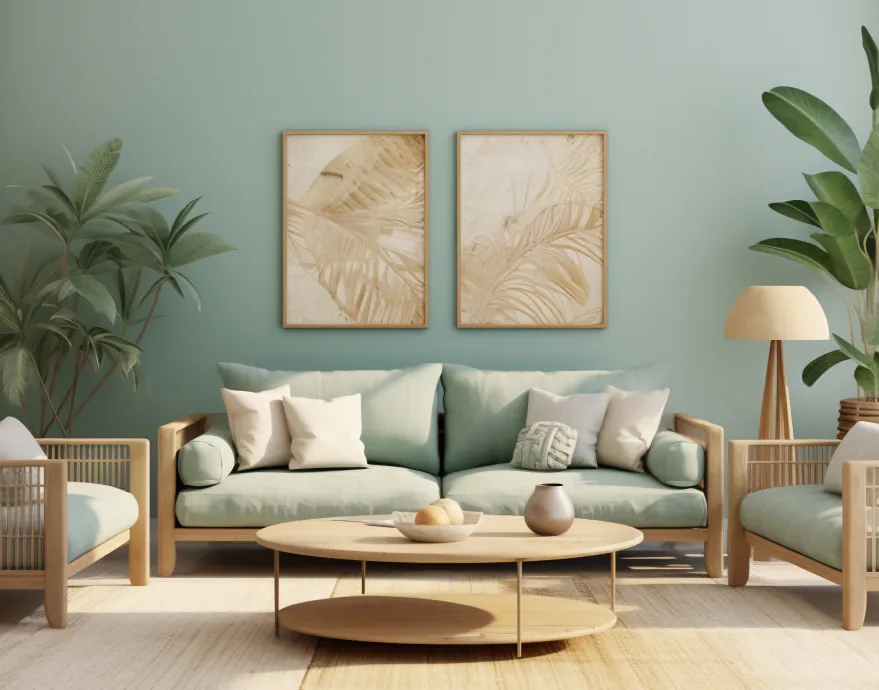
Large product imagery, fewer words, and a cleaner premium presentation.
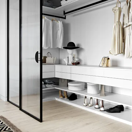
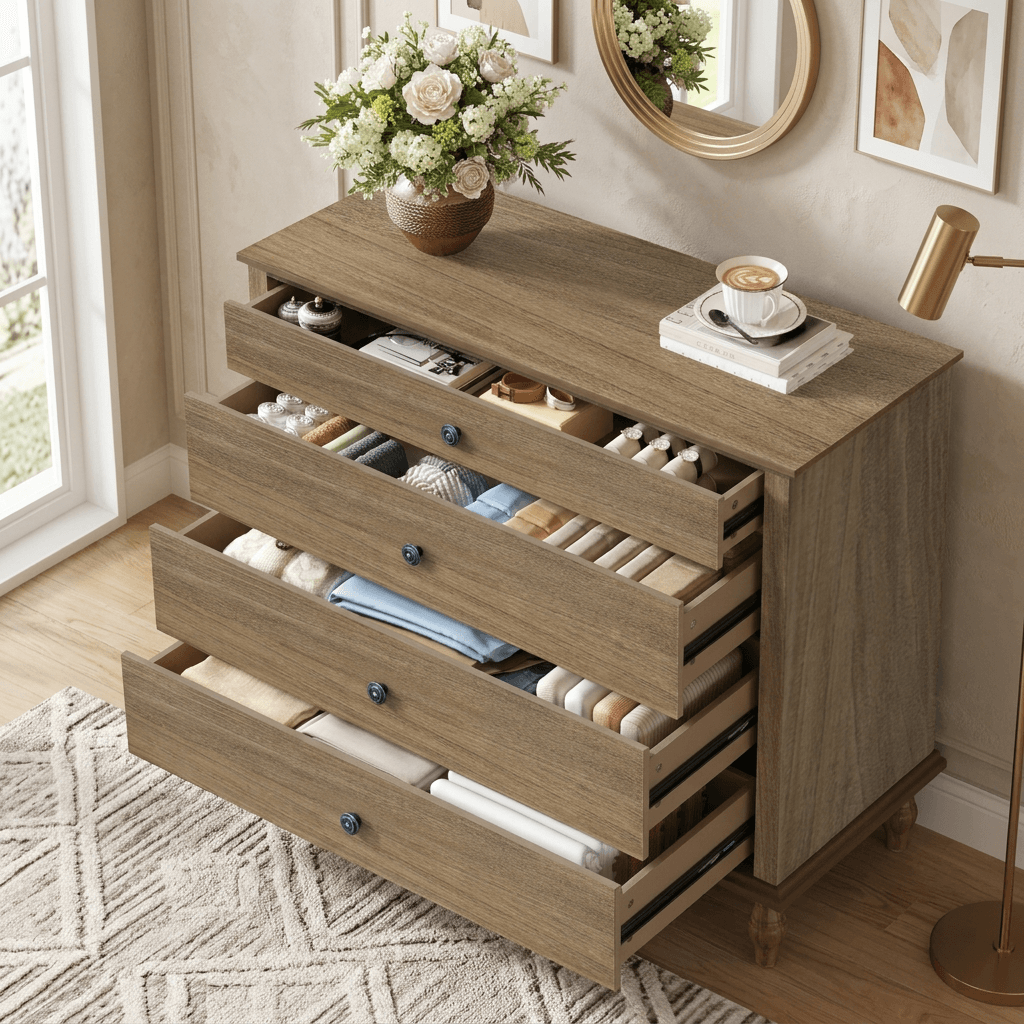
Architectural storage with a softer, more premium homepage presentation.
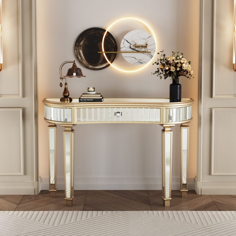
Curved silhouettes and reflective finishes framed with more restraint.
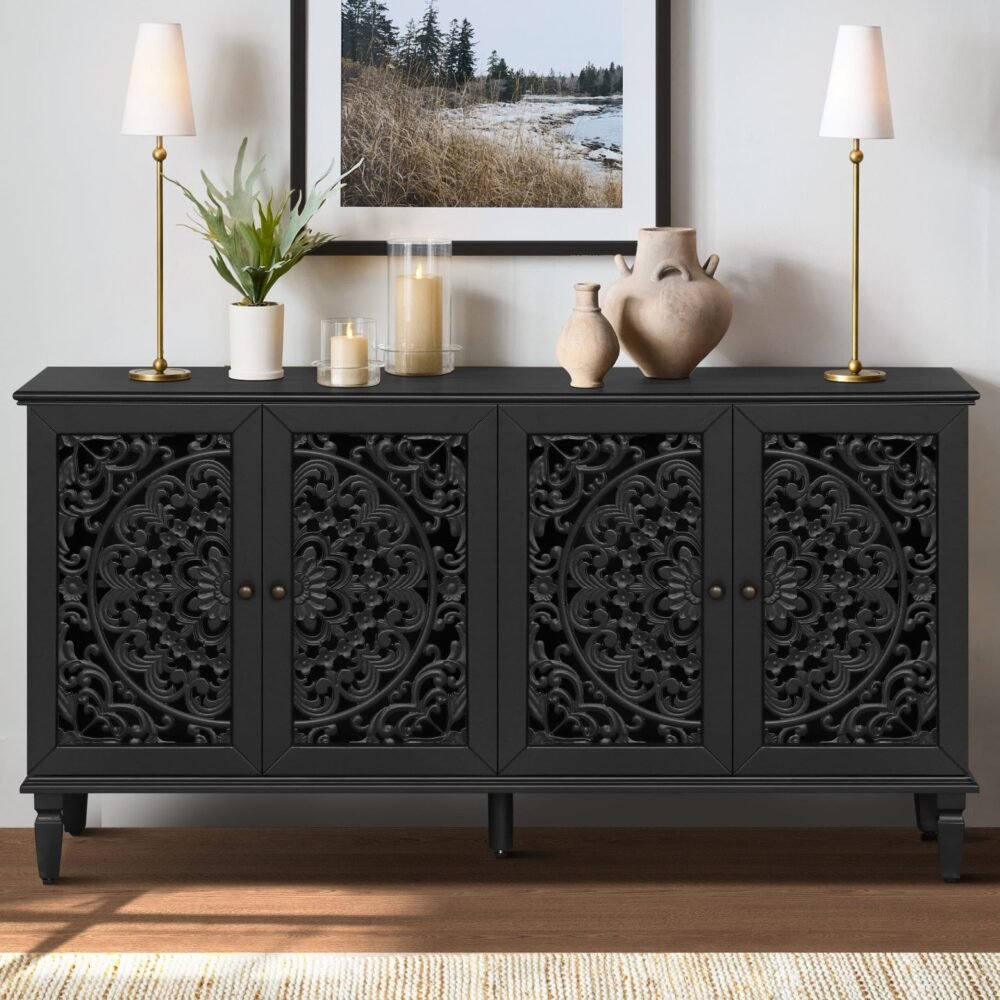
Less discount-store energy, more curated furniture gallery energy.
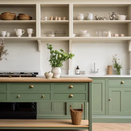
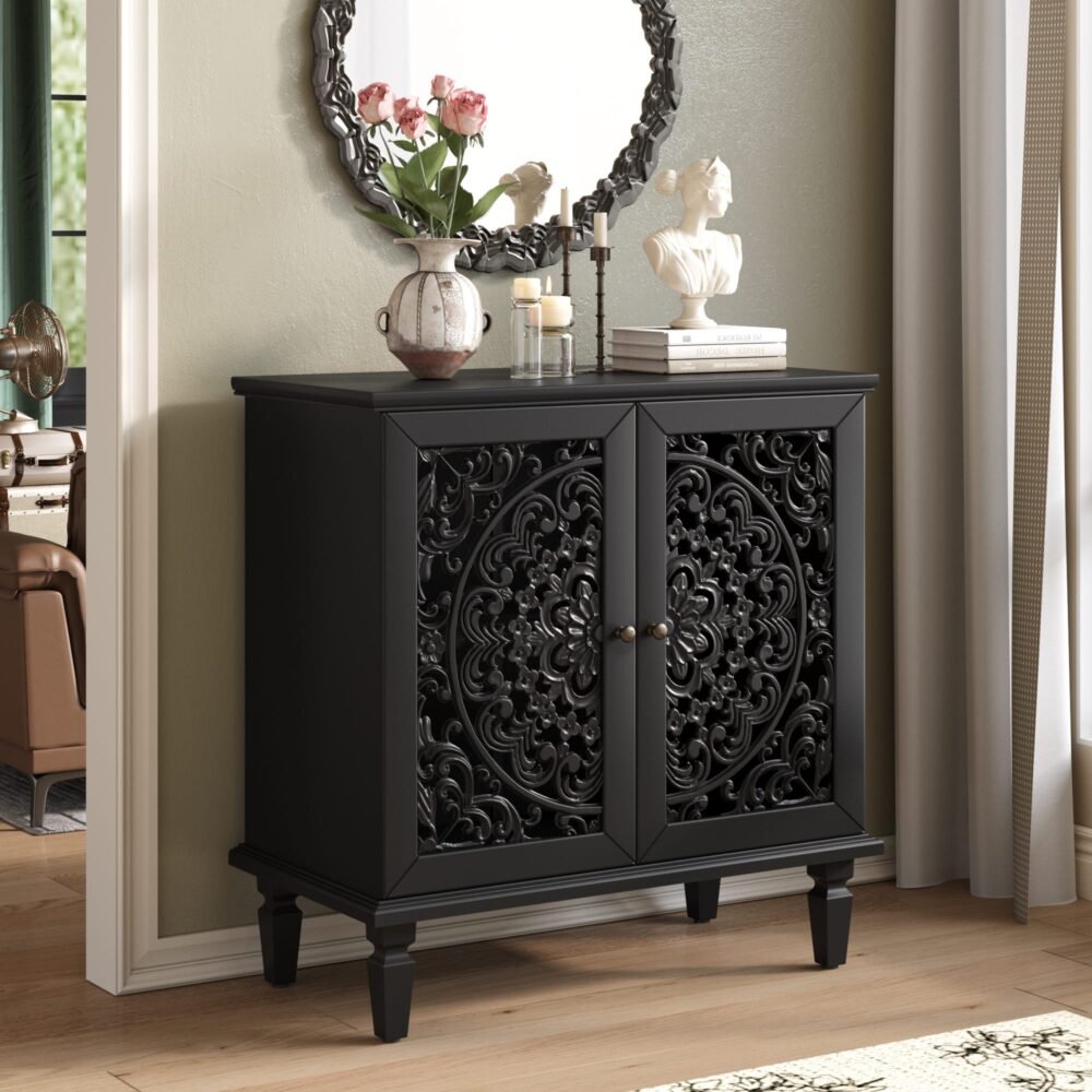
Presented more like a signature room piece than a crowded product tile.
A third full-width banner keeps the page image-led and leaves space for future seasonal stories.